潘忠显 / 2021-04-13
“JavaScript 工作原理”系列文章是翻译和整理自 SessionStack 网站的 How JavaScript works。因为博文发表于2017年,部分技术或信息可能已经过时。本文英文原文链接,作者 Alexander Zlatkov,翻译 潘忠显。
How JavaScript works: Under the hood of CSS and JS animations + how to optimize their performance

Apr 20, 2018 · 11 min read
This is post # 13 of the series dedicated to exploring JavaScript and its building components. In the process of identifying and describing the core elements, we also share some rules of thumb we use when building SessionStack, a JavaScript application that needs to be robust and highly-performant to help users see and reproduce their web app defects real-time.
If you missed the previous chapters, you can find them here:
- An overview of the engine, the runtime, and the call stack
- Inside Google’s V8 engine + 5 tips on how to write optimized code
- Memory management + how to handle 4 common memory leaks
- The event loop and the rise of Async programming + 5 ways to better coding with async/await
- Deep dive into WebSockets and HTTP/2 with SSE + how to pick the right path
- A comparison with WebAssembly + why in certain cases it’s better to use it over JavaScript
- The building blocks of Web Workers + 5 cases when you should use them
- Service Workers, their life-cycle, and use cases
- The mechanics of Web Push Notifications
- Tracking changes in the DOM using MutationObserver
- The rendering engine and tips to optimize its performance
- Inside the Networking Layer + How to Optimize Its Performance and Security
Overview
As you surely know, animations play an essential role in the creation of compelling web apps. As users increasingly shift their attention to UX and businesses start realizing the importance of flawless, enjoyable user journeys, web applications become heavier, and feature more dynamic UI. This all requires more complex animations for smoother state transitions throughout the journey of the user. Today, this is not even considered something special. Users are becoming more advanced, by default expecting highly responsive and interactive user interfaces.
Animating your interface, however, is not necessarily straightforward. What should be animated and when, and what kind of feel should the animation have, are all tough questions.
JavaScript vs CSS animations
The two primary ways to create web animations are by using JavaScript and CSS. There’s no right or wrong choice; it all depends on what you’re trying to achieve.
Animate with CSS
Animating with CSS is the simplest way to get something moving on the screen.
We’ll start with a quick example on how to move a 50px element in both the X and Y axes. It’s done by using a CSS transition that’s set to take 1000ms.
When the move class is added, the transform value is changed and the transition begins.
Besides the transition duration, there are options for the easing, which is essentially how the animation feels. We’ll go through easing in more detail later in this post.
If, as in the above snippet, you create separate CSS classes to manage your animations, you can then use JavaScript to toggle each animation on and off.
If you have the following element:
You can then use JavaScript to toggle each animation on and off:
var boxElements = document.getElementsByClassName('box'),
    boxElementsLength = boxElements.length,
    i;

for (i = 0; i < boxElementsLength; i++) {
  boxElements[i].classList.add('move');
}
The snippet above takes all the elements that have the box class and add the move class in order to trigger the animation.
Doing this provides a nice balance to your apps. You can focus on managing state with JavaScript, and simply set the appropriate classes on the target elements, leaving the browser to handle the animations. If you go down this route, you can listen to transitionend events on the element, but only if you’re able to forego support for older versions of Internet Explorer:
Listening for the transitioned event which is fired at the end of a transition, looks like this:
var boxElement = document.querySelector('.box'); // Get the first element which has the box class.
boxElement.addEventListener('transitionend', onTransitionEnd, false);

function onTransitionEnd() {
  // Handle the transition finishing.
}
In addition to using CSS transitions, you can also use CSS animations, which allow you to have much more control over individual animation keyframes, durations, and iterations.
Keyframes are used to instruct the browser what values CSS properties need to have at given points, and it fills in the gaps.
Let’s look at an example:
This is how it looks like (quick demo) — https://sessionstack.github.io/blog/demos/keyframes/
With CSS animations you define the animation itself independently of the target element and use the animation-name property to choose the required animation.
CSS animations are still somewhat vendor prefixed, with -webkit- being used in Safari, Safari Mobile, and Android. Chrome, Opera, Internet Explorer, and Firefox all ship without prefixes. Many tools can help you create the prefixed versions of the CSS you need, allowing you to write the unprefixed version in your source files.
Animate with JavaScript
Creating animations with JavaScript is more complex compared to using CSS transitions or animations, but it typically provides developers significantly more power.
JavaScript animations are written inline as part of your code. You can also encapsulate them inside other objects. Below is the JavaScript that you would need to write to re-create the CSS transition described earlier:
var boxElement = document.querySelector('.box');
var animation = boxElement.animate([
  {transform: 'translate(0)'},
  {transform: 'translate(150px, 200px)'}
], 500);
animation.addEventListener('finish', function() {
  boxElement.style.transform = 'translate(150px, 200px)';
});
By default, Web Animations only modify the presentation of an element. If you want to have your object remain at the location it was moved to, then you should modify its underlying styles when the animation has finished. This is why we’re listening for the finish event in the above example, and set the box.style.transform property to equal translate(150px, 200px) which is the same as the second transformation performed by our animation.
With JavaScript animations, you’re in total control of an element’s styles at every step. This means you can slow down animations, pause them, stop them, reverse them, and manipulate elements as you see fit. This is especially useful if you’re building complex, object-oriented applications, because you can properly encapsulate your behavior.
What is Easing?
Natural motion makes your users feel more comfortable with your web apps, which leads to a better UX.
Naturally, nothing moves linearly from one point to another. Actually, things tend to accelerate or decelerate as they move in the physical world around us since we’re not in a vacuum and there are different factors that tend to impact this. The human brain is wired to expect this kind of motion, so when you’re animating your web apps, you should use this knowledge to your advantage.
There’s terminology that you need to understand:
- “ease in” — this is when a motion starts slowly and then accelerates.
- “ease out” — this is when a motion starts quickly and then decelerates.
These two can be combined, for example “ease in out”.
Easing allows you to make animations feel more natural.
Easing keywords
CSS transitions and animations allow you to choose the kind of easing you want to use. There are different keywords that affect the easing of the animation. You can also make your easing completely custom.
Here are some of the keywords that you can use in CSS to control the easing:
linearease-inease-outease-in-out
Let’s go through all of them and see what they really mean.
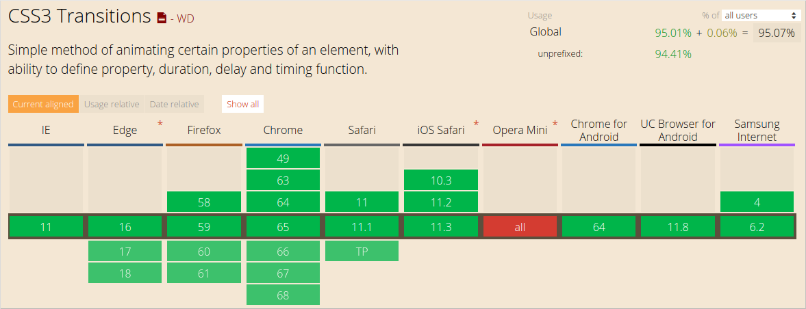
Linear animations
Animations without any kind of easing are referred to as linear.
Here is how a graph of a linear transition looks like:
As time goes by, the value increases in equal amounts. With linear motion, things tend to feel unnatural. Generally speaking, you should avoid linear motion.
This is how a simple linear animation can be achieved:
transition: transform 500ms linear;
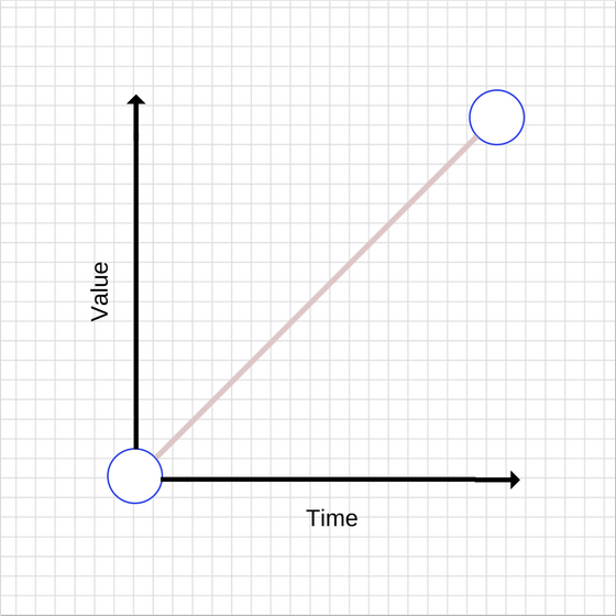
Ease-out animations
As mentioned earlier, easing out causes the animation to start more quickly compared to the linear ones, while it slows down at the end. This is how its graph looks like:
In general, easing out is best used for UI work because the quick start gives your animations a feeling of responsiveness, while the slow-down at the end feels natural due to the inconsistent motion.
There are many ways to achieve an ease out effect, but the simplest is the ease-out keyword in CSS:
transition: transform 500ms ease-out;
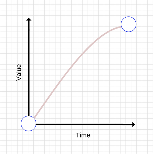
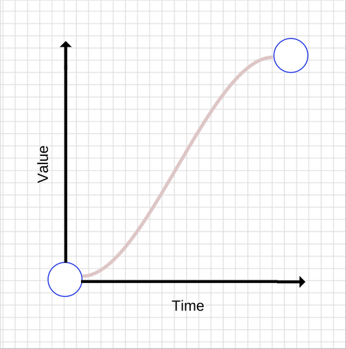
Ease-in animations
These are the opposite of the ease-out animations — they start slowly and end fast. This is how their graph looks like:
Compared to ease-out animations, ease-ins can feel unusual because they create a feeling of unresponsiveness since they start slowly. The fast end can also create a strange feeling, since the whole animation is accelerating while objects in the real world tend to decelerate when stopping suddenly.
To use an ease-in animation, similarly to ease-out and linear animations, you can use its keyword:
transition: transform 500ms ease-in;
Ease-in-out animations
This animations is a combination of ease-in and ease-out. This is how its graph looks like:
Don’t use animation durations that are too long, as they make it feel as if your UI is unresponsive.
To get an ease-in-out animation, you can use the ease-in-out CSS keyword:
transition: transform 500ms ease-in-out;
Custom easing
You can define you own easing curves which provides a lot more control over the feel your project’s animations create.
In reality, the ease-in, ease-out, linear, ease keywords map to predefined Bézier curves, which are detailed in the CSS transitions specification and the Web Animations specification.
Bézier curves
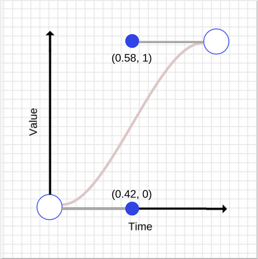
Let’s see hоw Bézier curves work. A Bézier curve takes four values, or more precisely it takes two pairs of numbers. Each pair describes the X and Y coordinates of a cubic Bézier curve’s control point. The starting point of the Bézier curve has a coordinate (0, 0) and the end coordinate is (1, 1). You can set both of the pair numbers. The X values for the two control points must be in the [0, 1] range, and each control point’s Y value can exceed the [0, 1] limit, although the spec isn’t clear by how much.
Even slight changes in the X and Y value of each control point gives you a completely different curve. Let’s take a look at two graphs of Bézier curves with points having close but different coordinates.
and
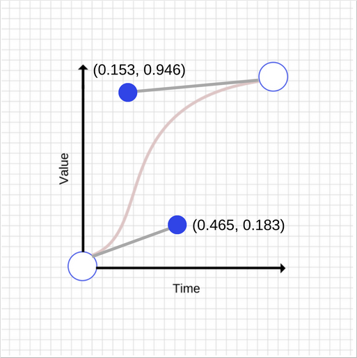
As you see, the graphs are quite different. The first control points have a (0.045, 0.183) vector difference, while the second control points have a (-0.427, -0.054) difference.
This is how the CSS for the second curve looks like:
transition: transform 500ms cubic-bezier(0.465, 0.183, 0.153, 0.946);
The first two numbers are the X and Y coordinates of the first control point, and the second two numbers are the X and Y coordinates of the second control point.
Performance optimizations
You should maintain 60fps whenever you are animating, otherwise it will negatively impact your users’ experience.
As everything else in the world, animations do not come free. Animating some properties is cheaper than others. For example, animating width and height of an element changes its geometry and may cause other elements on the page to move or change size. This process is called layout. We have discussed layout and rendering in more detail in one of our previous posts.
In general, you should avoid animating properties that trigger layout or paint. For most modern browsers, this means limiting animations to opacity and transform.
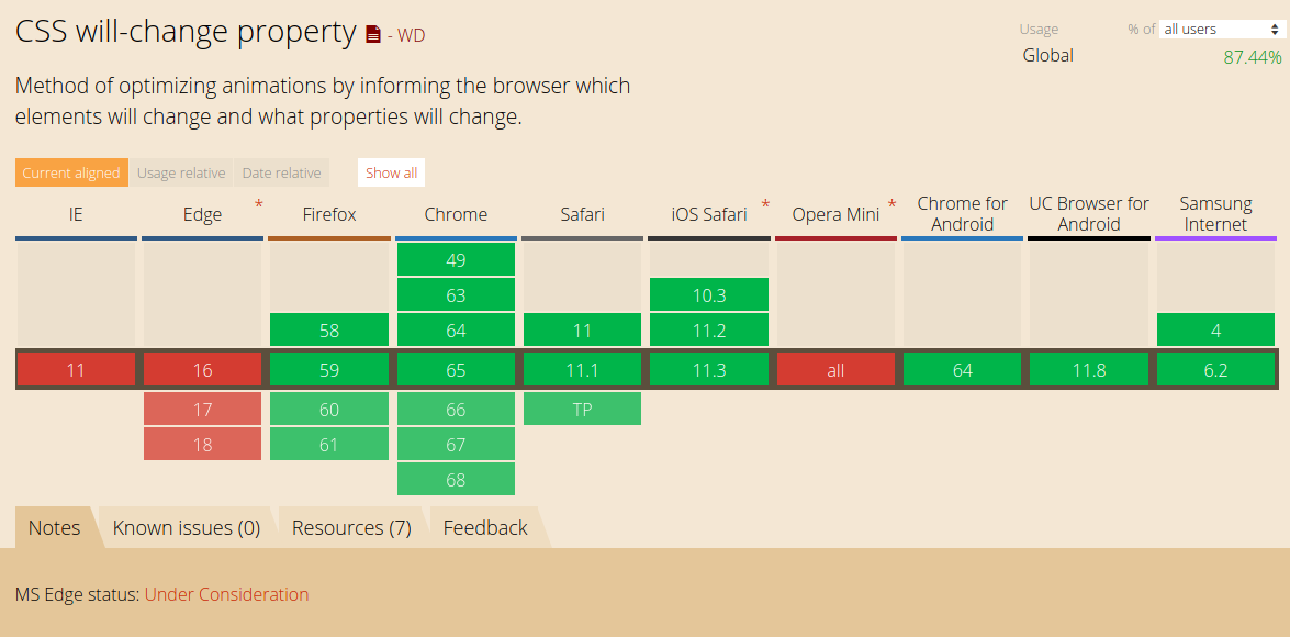
Will-change
You can use will-change to inform the browser that you intend to change an element’s property. This allows the browser to put the most appropriate optimizations in place ahead of when you make the change. Don’t overuse will-change, however, because doing so can cause the browser to waste resources, which in turn causes even more performance issues.
Adding will-change for transforms and opacity looks like this:
.box {
  will-change: transform, opacity;
}
The browser support for Chrome, Firefox and Opera is quite good.
Choosing between JavaScript and CSS
You probably saw it coming already — there is no right or wrong answer to this question. You just have to keep the following things in mind:
- CSS-based animations, and Web Animations where supported natively, are typically handled on a thread known as the “compositor thread.” It’s different from the browser’s “main thread”, where styling, layout, painting, and JavaScript are executed. This means that if the browser is running some expensive tasks on the main thread, these animations can keep going without being interrupted.
- Changes to
transformsandopacitycan, in many cases, also be handled by the compositor thread. - If any animation triggers paint, layout, or both, the “main thread” will be required to do work. This is true for both CSS- and JavaScript-based animations, and the overhead of layout or paint will likely dwarf any work associated with CSS or JavaScript execution, rendering the question moot.
Choose the right things to animate
Great animations add a layer of enjoyment and engagement to your projects for your users. You can animate pretty much anything you like, whether that’s widths, heights, positions, colors, or backgrounds, but you need to be aware of potential performance bottlenecks. Poorly chosen animations can negatively affect user experience, so animations need to be both performant and appropriate. Animate as less as possible. Animate only to make your UX feel natural but don’t over-animate.
Use animations to support interactions
Don’t just animate something because you can. Instead, use strategically placed animations to reinforce the user interactions. Avoid animations that interrupt or obstruct the user’s activity unnecessarily.
Avoid animating expensive properties
The only thing worse than animations that are poorly placed are those that cause the page to stutter. This type of animation leaves users feeling frustrated and unhappy.
We go pretty easy on using animations in SessionStack. In general, we follow the practices mentioned above but we also have a few more scenarios where we utilize animations due to the complexity of our UI. SessionStack has to recreate as a video everything that happened to end users at the time they experienced an issue while browsing a web app. To do this, SessionStack leverages only the data that was collected by our library during the session: user events, DOM changes, network requests, exceptions, debug messages, etc. Our player is highly optimized to properly render and make use of all the collected data in order to offer a pixel-perfect simulation of end users’ browser and everything that happened in it, both from a visual and technical standpoint.
To ensure the replication feels natural, especially with long and heavy user sessions, we use animations to properly indicate loading/buffering and follow best practices on how to implement them so that we don’t take up too much CPU time and leave the event loop free to render the sessions.
There is a free plan if you’d like to give SessionStack a try.
